Social health authorities in Kenya
The Dynamic Identity of the NBA: A Logo's Evolution
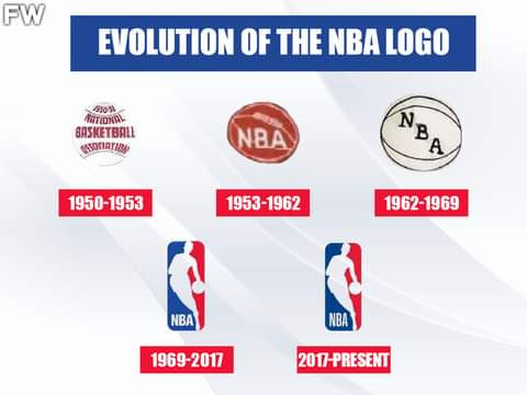


The NBA logo is one of the most iconic sports symbols in the world, instantly recognizable and filled with history. It's not just a corporate emblem; it represents decades of athletic excellence, cultural impact, and the evolution of basketball itself. Let's dive into the transformation of this legendary logo over the years.
The Early Days
The NBA was established on June 6, 1946, as the Basketball Association of America (BAA) and went through several changes before settling on the name we know today. The original logos were simple and functional, reflecting the straightforward nature of the post-war era.
The Birth of a Classic
In 1969, the NBA introduced a new logo that would become a defining image for the league. Inspired by the dynamic movement of the players, the logo featured the silhouette of a man dribbling a basketball. The colors—red, white, and blue—were chosen to reflect a patriotic spirit.
The Logo's Inspiration
The silhouette in the NBA logo is widely believed to be based on Jerry West, a legendary player known for his skill and sportsmanship. While the NBA has never officially confirmed this, West's outline captures the essence of basketball's fluidity and grace.
Modern Adaptations
Over the years, the NBA logo has seen subtle tweaks but has largely remained consistent. This consistency has helped the logo become a symbol of stability and tradition in a league that is always evolving.
A Symbol for the Future
As the NBA continues to grow globally, the logo stands as a beacon for the sport, inviting new generations of fans and players to be part of the basketball family. It's a reminder that while the game may change, the spirit of competition and camaraderie
remains the same.
Popular posts from this blog
Fever star Caitlin Clark’s euphoric reaction to Taylor Swift’s guesting on Travis Kelce’s show

"Two silhouettes in sync—white threads, bold prints, and the pulse of a room alive with memory. Magnum Lounge doesn’t just host nights, it archives legacy." "Two minds, one brand—Punchline stitched across chests like a quiet manifesto. A golden drink, a white couch, and the geometry of connection." "Three styles, one rhythm—pink punchlines, white grind, and denim defiance. Under the haze of hookah and dim light, the night writes its own manifesto." "Two figures in warm light—Punchline stitched in pink, a quiet logo in black. Between them, a night unfolding like a well-kept secret." "Checkered boldness meets Punchline finesse—Magnum Bar & Lounge is where contrast becomes chemistry. #SMARTSWAGS #StyleInStereo" "Two hands raised, two styles aligned—denim ease and branded calm. Beneath the glow of sport and woodgrain, the night finds its rhythm." "Blue stripes and pink threads—two style...
Frankenstein’ rabbits with horrifying spikes growing from their heads are invading the US — and experts warn to stay away

TV & RadioCelebrity NewsFilmsGamingMusicBooksTheatre HomeShowbiz & TVTV & Radio Hollywood star Goldie Hawn transitions to TV DIY guru with new home improvement show

"Purple reign in motion—where mesh meets mood, and the night blinks back with style." Moments steeped in calm—where time slows, laughter lingers, and luxury wears a robe." "Crimson rituals in the grip of dusk—garnished with lime, stirred with legacy, and poured for the culture." "Elegance plated. Every fork, every fold, every glass—arranged like a promise whispered before the first bite." Spoonful of story—rich with spice, soul, and the kind of care that doesn't clock out." "Double Black and double trouble—where toast meets taste, and every glass waits for a story." Cognac center stage, flanked by fizz—where legacy meets cola, and every pour’s a soft-spoken power move." "Three pillars under one sky—fashion, fellowship, and a fierce love for the land." Red-coded chill. A crown in cap and cocktails—commanding the table with quiet confidence." Brick-backed cockt...
Comments
Post a Comment